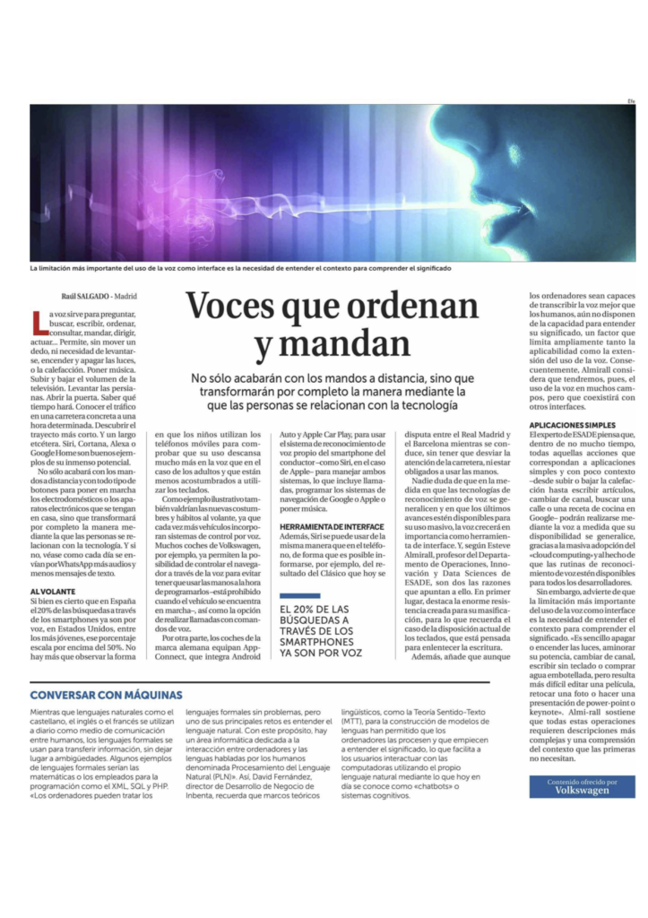
Mi contribución a La Razón sobre la evolución de los User Interfaces
http://www.larazon.es/tecnologia/innovacion/voces-que-ordenan-y-mandan-AD17276547
Last Monday, October 23, 2017 we held our first session of the Speaker Series on Data, Analytics and Cloud in our Master of Science in Business Analytics program.

This first edition was devoted to Visualization. How to visualize complex data is an important part in any data driven strategy. Not only because of need to transmit the discourse in a convincing and compelling manner but also because visualization facilities to uncover and make visible hidden relationships promoting a discussion around them.
If visualization for Analysis is important, when it becomes integrated in the user interface either favoring data exploration or allowing to manage sophisticated AI applications, then it turns out because data visualization becomes the interface itself.
The field is evolving rapidly, developments such as DS3, Python libraries such as Bokeh, Plot.ly or recently Dash are democratizing the capacity of building sophisticated visualizations and the UX around them. However, this is only the beginning, the new developments in AR-VR promise a quantum leap in visualization.
We had three great Speakers in this first edition:
-
-
-
- Mark Schindler – GroupVisual.io
- Alberto Gonzalez – Bestiario bestiario.org
- David Nogué – Eixos eixos.cat
- Victor Pascual Cid – One Tandem – onetandem.com
-
-
Before the Speaker Series I had the opportunity to talk to Mark Schindler, here is the result

